QUINDÍO
Design Research /Brand Identity
2021
Quindío, a vibrant region in Colombia, is renowned for its rich culture, breathtaking landscapes, colorful architecture, and world-famous coffee. As part of Colombia’s Coffee Triangle, it stands out for its unique coffee heritage and culture. However, in our rebranding process, we chose to focus not on coffee itself but on the emotions it evokes.
Inspired by the essence of Quindío, we developed a cohesive identity around the concept of 'Vibrance'. This captures the dynamic energy of the region, blending its timeless traditions with a touch of modernity, honoring its authenticity while infusing it with fresh, contemporary appeal.
in collaboration with Mariane Meshaka, Luca Calandri, Azzam Thadey.
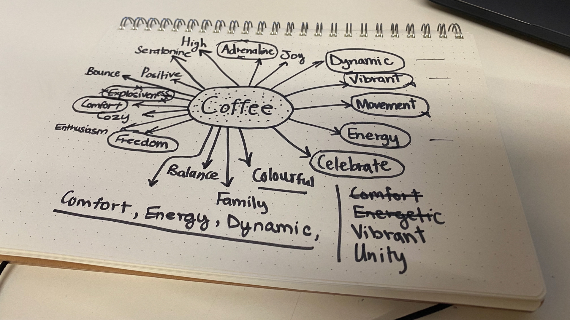
Concept Development
Logotype and Symbol
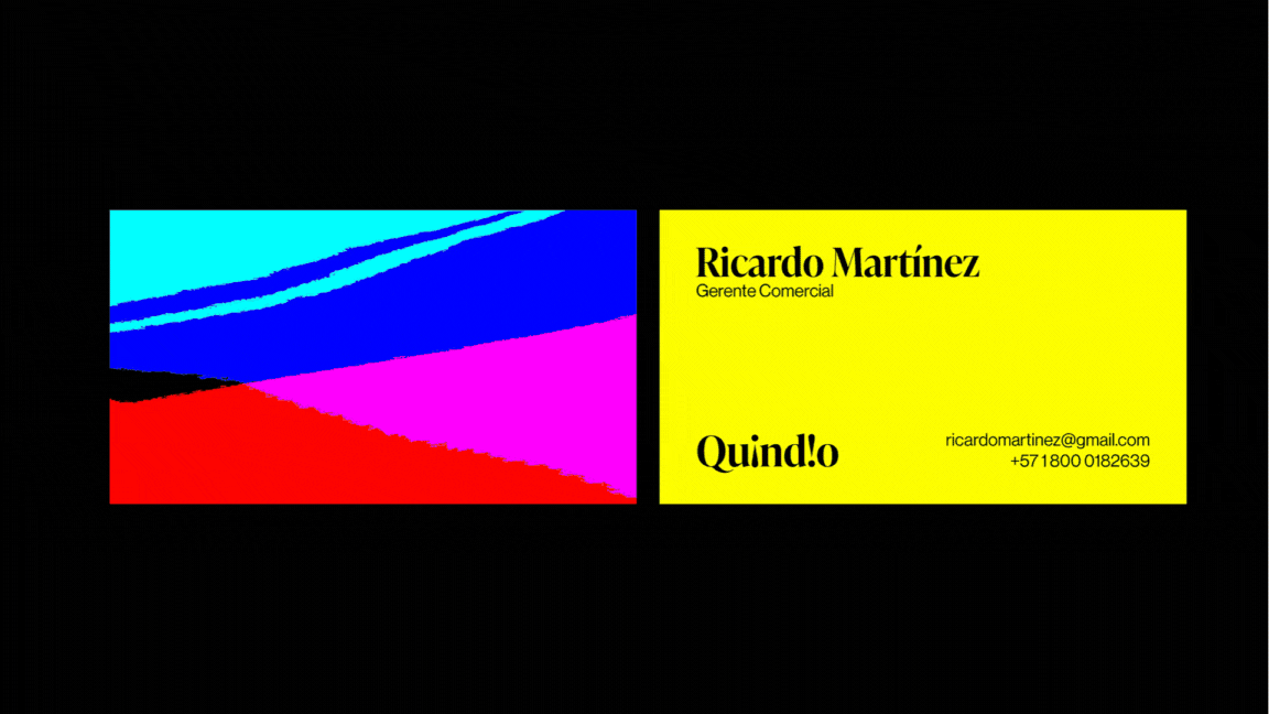
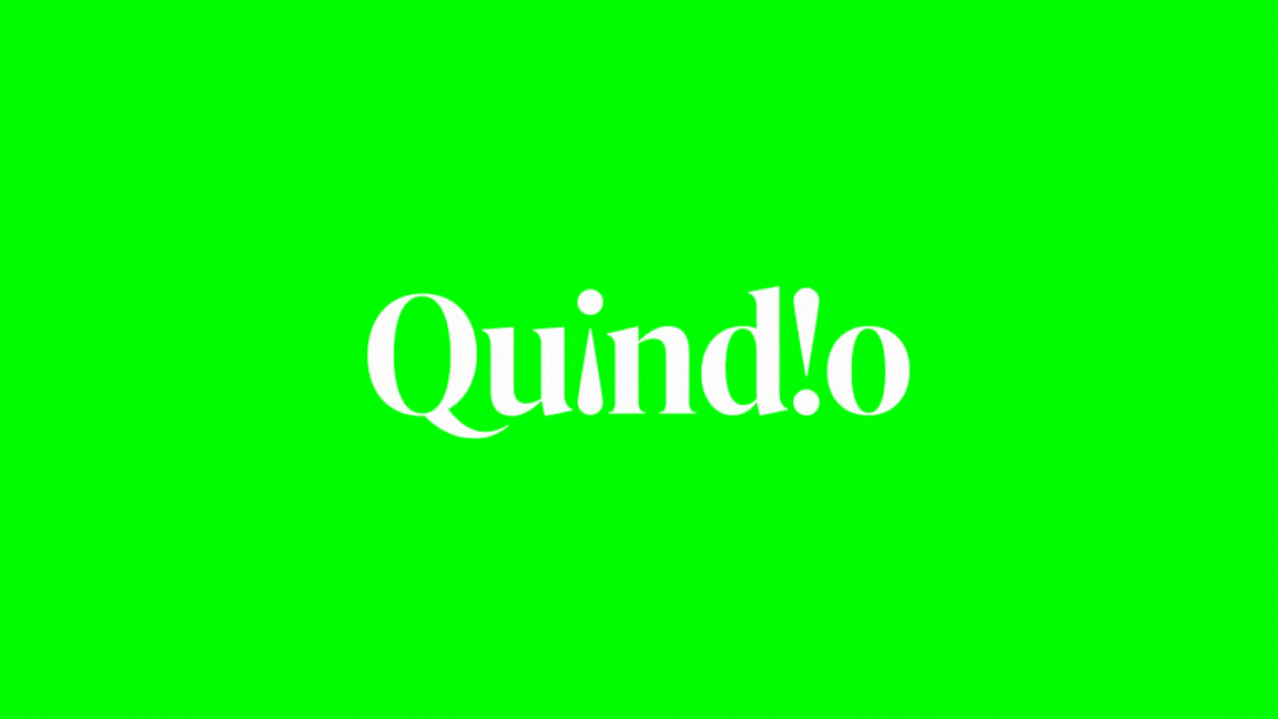
The Quindío logotype was developed from the combination of two exclamation marks and the word Quindío itself. Exclamation marks are used to portray strong feelings and show an emphasis, and thus the concept of vibrance was best reflected in this simple icon that replaced the 'i' in the word Quindío.
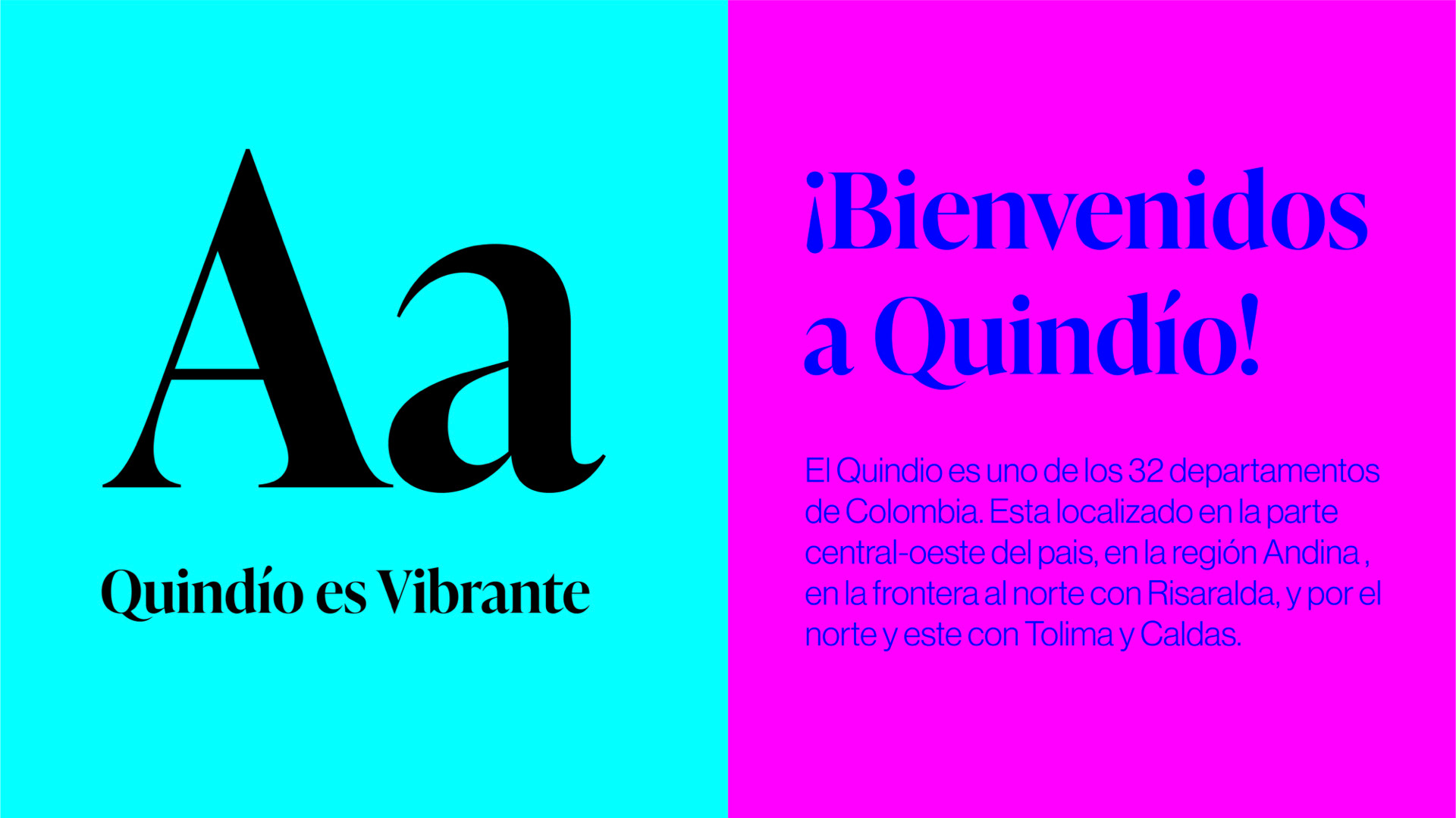
Colour and Typography
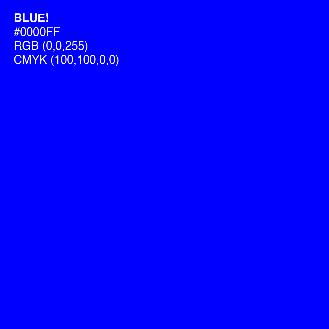
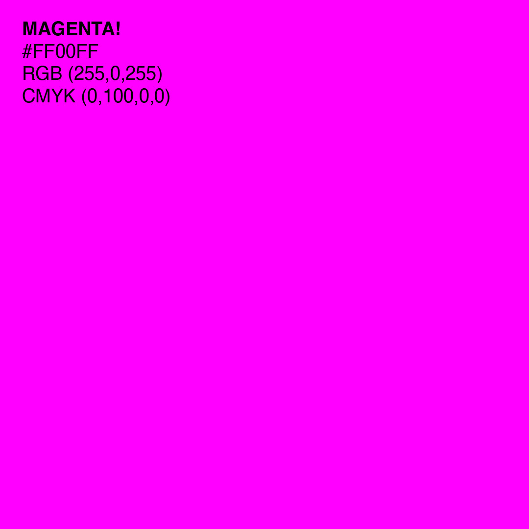
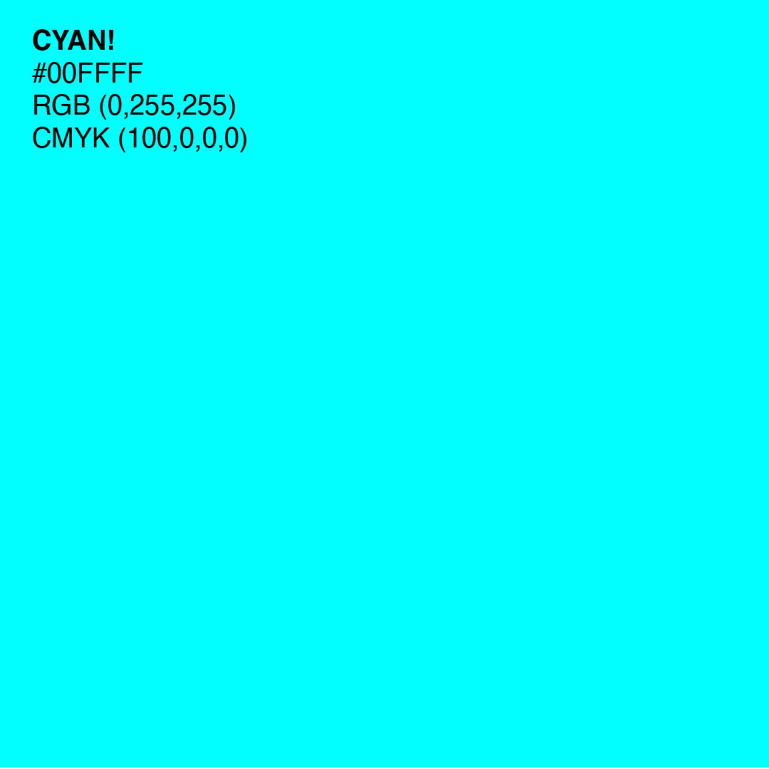
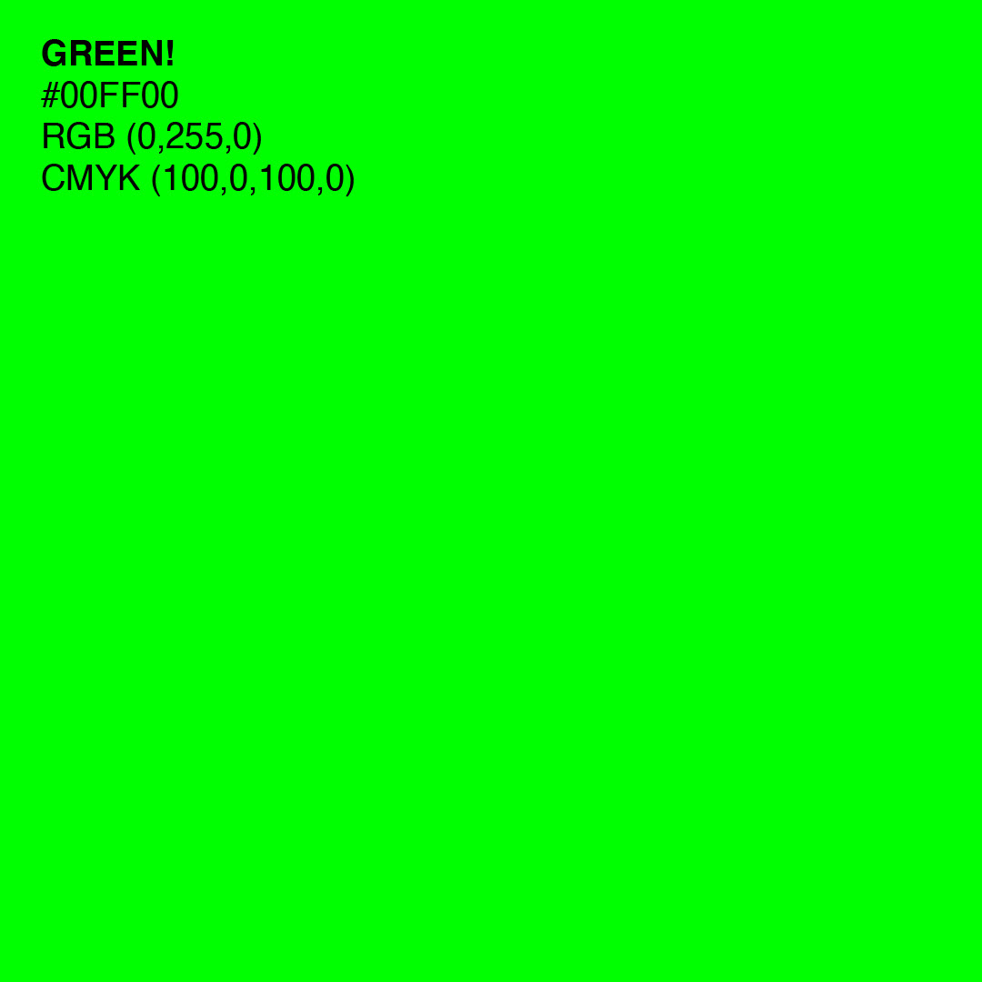
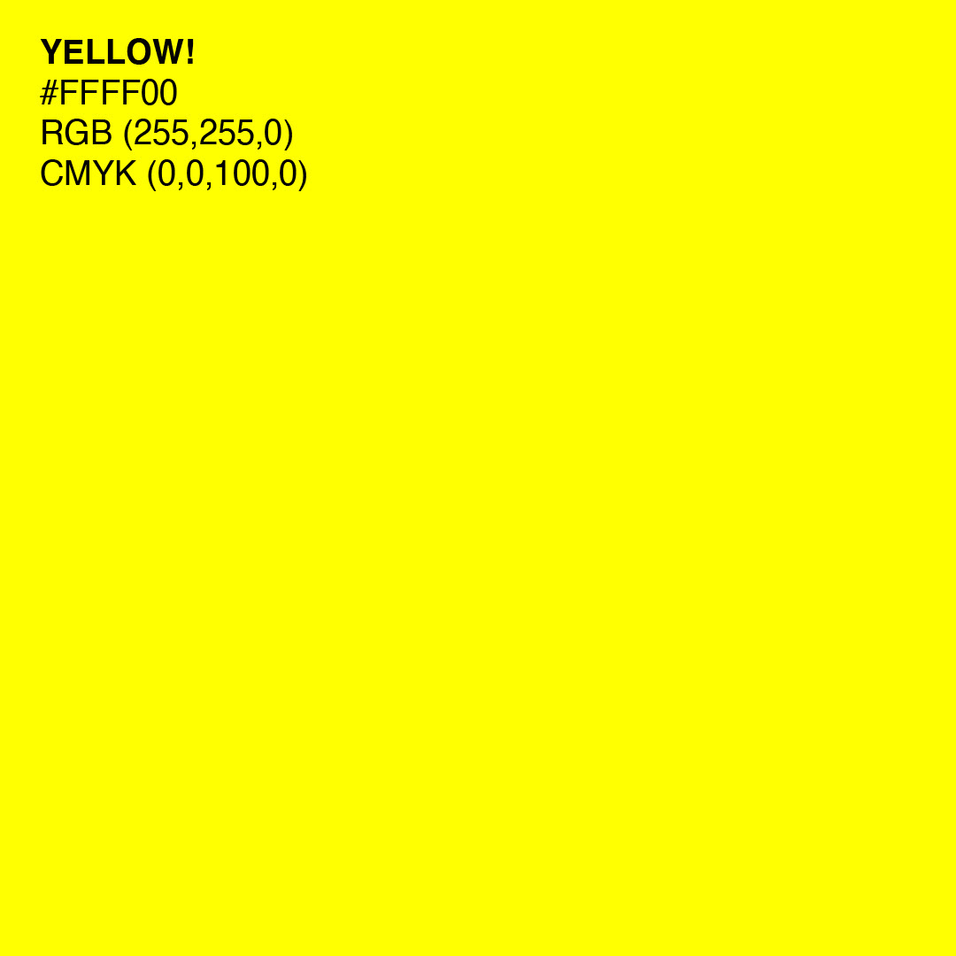
The inspiration for the colour palette came from the 6 most vibrant colours on the colour wheel in their truest form. For the typography, two typefaces were chosen based on their uses for titles and text. Ivy Presto Display is used for headings and titles due to its handwritten form that connects back to the traditional roots of Quindío. For more smaller texts, Neue Haas Grotesk Display Pro is used for its legibility and simplicity.
Design System and Applications